Nab
UX . UI
Problem
Solution
Nab connect launched one of their biggest projects when I joined, this was to revamp the entire Nab connect platform, from login to payments etc.
Impact
Projects during my time in Nab included:
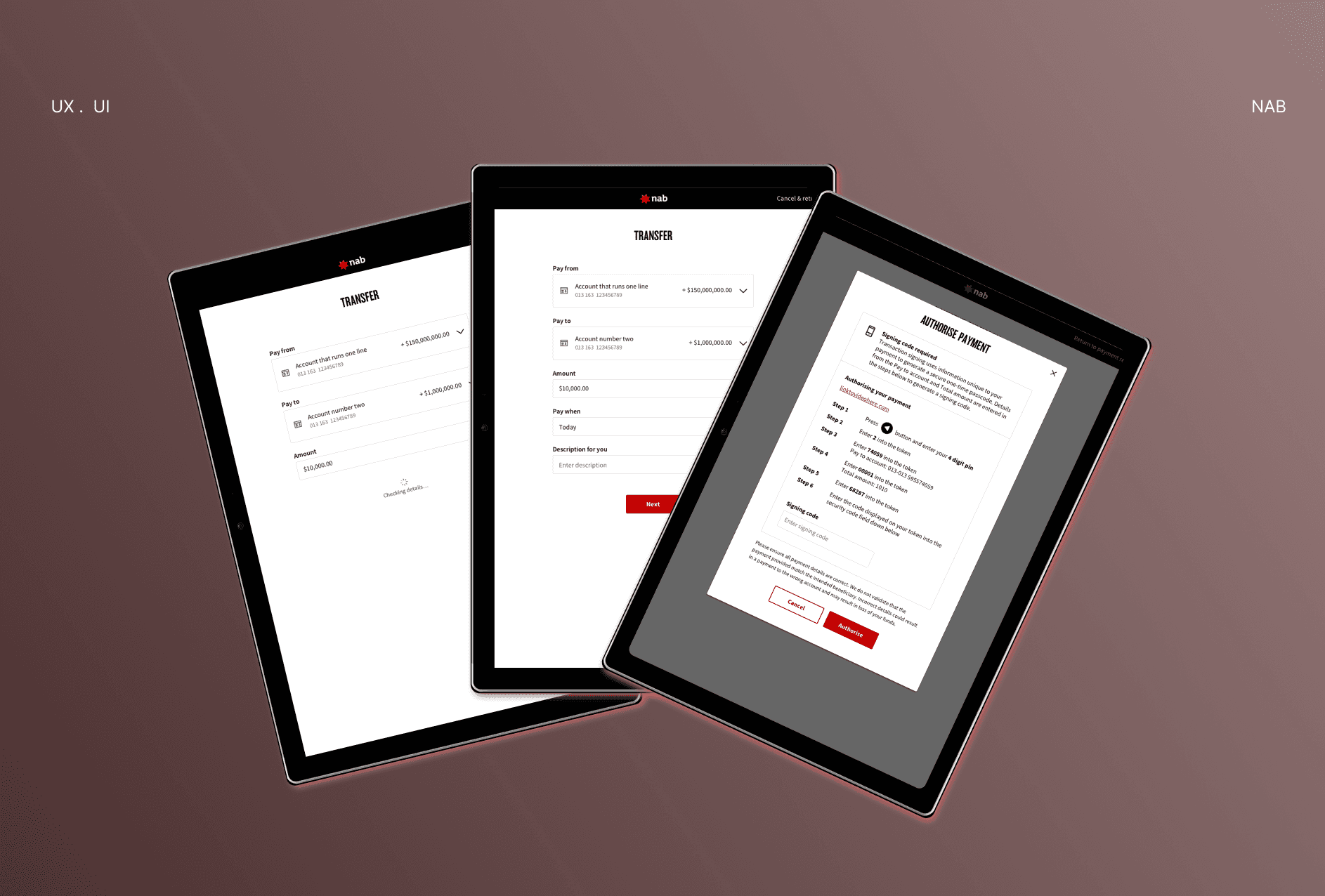
Payment authorisation
One-time passcodes
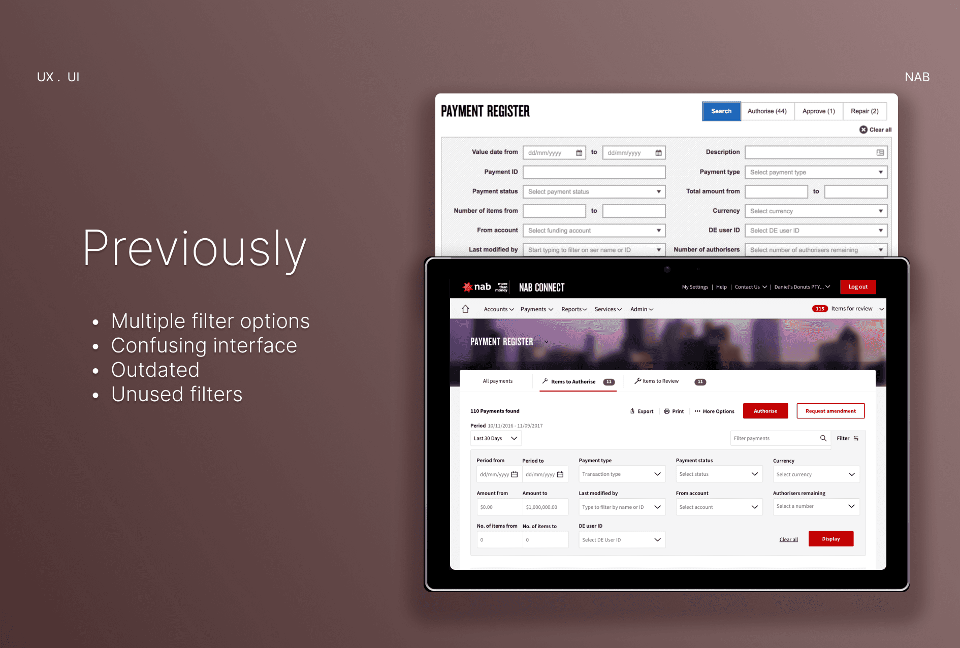
Filter options for payment registration
Aside from project work I also assisted with research activities; creating user journeys, personas, user testing sessions and synthesis.
Authorising payment with OTP
One of the key features that needed to be considered when enhancing the business internet banking experience was one-time passcode (OTP) for payment authorisations.
Business internet banking involves large sums of transactions from one account to another. This is a procedure that involves risks for the the user and the business. In order for both parties to safely complete the transactions a one time password and authorisation is required to reduce potential risks.
The authorised party must approve of the transaction created and enter a one-time passcode. Only after this process is completed the payment will be authorised.
It may sound like a simple process, but the procedure to arrive at this took a long journey, from creating user flows, tasks flows, wireframes, guerrilla testing and multiple iterations.

Filter options
Filter options is always a challenge, especially when the previous filter option looks like something from the 1990s.
To tackle this, I looked at data and analytics of which of these filter options were most used and which we could remove. Filters are used to help assist in searching through large sums of data but too much filter options can also make it too difficult to use. I conducted a range of research prior to starting the design process.
Through my analysis I came up with user flows of how each user would choose to filter. Using rapid prototyping I continually iterated on my designs by getting constant feedback from users.
The end result reduced filter options by over 50%, allowing users to easily navigate and filter through their payments.

