Moodle
UX . UI
Problem
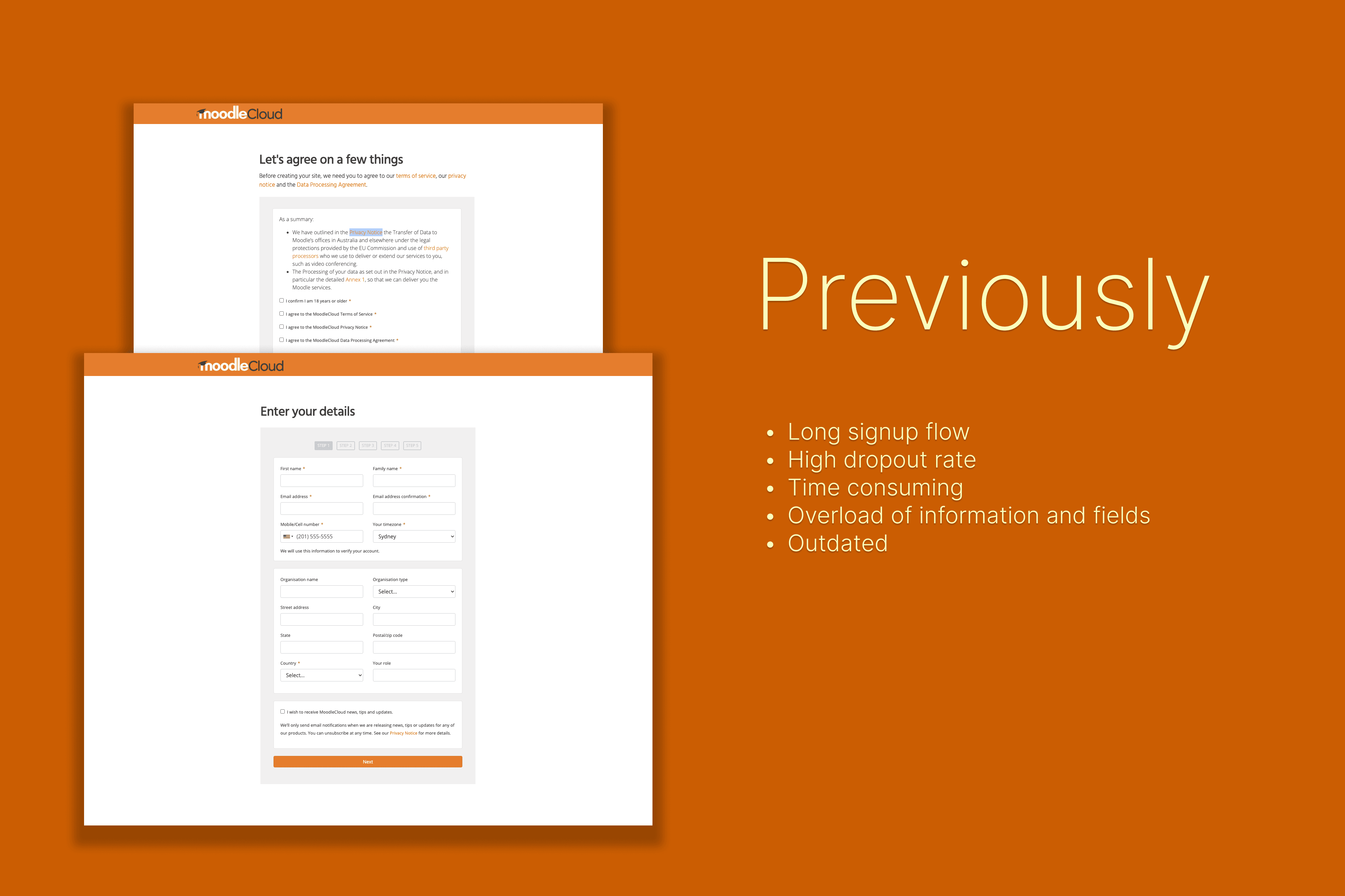
There was a large dropout of users during the signup process. The business thought it may have been due to too many clicks.
Solution
I started by conducting a Heuristic evaluation as well as reviewing Google analytics to identify potential points of dropout during the signup process.
I then provided recommendations to map out old/new task flows and service blueprints prior to starting designs.
The final designs reduced the overall flow from a 6 page form to a one pager simple signup.
Impact
Projects I worked on during my time in Moodle included:
Signup
4.0 Trial
Plan upgrade
Plan pricing
Site rename
Aside from project work, I also helped educated the MoodleCloud team with UX practices and embedded UX knowledge. Mentored and guided the team to facilitate UX Research as well as run successful workshops.

Research
Conducted Heuristic evaluation on the current flow
Tracked google analytics to find out where users were dropping off
Created current/future state task flows
Removed OTP
Capture details about the free trial plan (whats included)
Current/future state service blueprints
Fields required & not required
Removed unnecessary details

Design
Reduce the form to just a one pager
Automatically capture users information from IP location
Worked with legal team to reduce T&Cs from full page 5 checkboxes to a simple sentence and 2 checkboxes.
Displayed loader so that user knows it’s being processed
Clear success screen taking them to their MoodleCloud site
Metrics & Outcomes
Implemented Google analytics on the signup flow to track statistics
Generated 5x more users signing up in the first 4 months after we the changes were live